March 2017
The rise of the retro logo
Seen the new Co-Op logo? Look familiar? How about NatWest? Or Kodak? Well, be prepared to see a whole load of new ‘old’ logos this year as more and more big brands turn to their archives in an attempt to realign themselves with their past values.
It’s no coincidence this trend is happening. As a direct reaction to the ‘anti-corporate’ feeling that is sweeping the world (as illustrated by Brexit and the election of Donald Trump), many major corporate brands are now being influenced by an overwhelming desire to simplify things, to communicate their history and change perceptions of them.
Take Co-Op for example. As a business they lost their way in recent years. A confusing brand strategy, negative press and a downturn in reputation had resulted in the company losing market share. Time to rethink things and get back to the heart of the business then.
And it’s much more than the simple reemergence of the iconic cloverleaf logo. Co-op employees across the UK will also be taking part in a ‘Back to being Co-op’ programme, designed to help educate them about the benefits of the Co-op membership and truly understand the brand’s values.
“This is what the Co-op is all about,” said Richard Pennycook, CEO of the Co-op. “Big business is often accused of taking money out of communities – we are putting it back in as we champion a better way of doing business for our members and their communities.
“Our intention is to return to paying a dividend again, but we also want to make the rewards for members who trade with the Co-op more meaningful and community focused. We’re already seeing good momentum across our businesses and this will drive further growth which our members and their communities will benefit from. It clearly demonstrates the Co-op difference being delivered every day.”*
The legal benefits of a bit of nostalgia
There’s other reasons for diving into the archives than just restoring a sense of heritage (and dishing out some rose-tinted spectacles whilst you’re at it) – from a legal standpoint it makes perfect sense. After all, if something has already existed for a long time, you’re unlikely to encounter many of the legal hurdles than a completely new symbol has to overcome to get approval on a global scale. It’s easier, and often more effective, to simply tweak what has gone before.
“What we’ve been seeing with Co-op, and arguably Coca-Cola before that, is a return to simplicity and a ‘stripping back’ of some of the clutter that some brands gather around themselves.”
Michael Johnson, Johnson Banks
But is it a good thing?
So, whilst everyone may soon jump on the retro bandwagon, as a business it’s worth considering a few things before starting to rummage in the attic for some inspiration from days gone by. Ask yourself, “were we a better business back then?” – if the answer is yes then maybe it is time to reflect on past values and hark back to your heritage, but if the answer is no, then close the door of the attic and look to the future instead.
*Source: http://www.thenews.coop/105734/news/business/return-co-op-co-operative-group-rebrands/
The rise of the retro logo,
17th March 2017
Words and pictures
If you’re in any way connected to the world of design, or interested in its increasing convergence with technology, then John Maeda’s latest Design in Tech report is a must read.
One observation that resonates most with us, is that in our quest to engage audiences through sleek, intuitive interfaces, words are becoming more powerful than graphics. Yet the report points to an industry focused on all things visual, and to an over reliance on the interface — to the extent that writing itself has been left behind as a design skill. Trends in digital design lean on minimalist clean lines and few words — which give language itself more weight. But if not written well, the final product can lack the clarity it needs to be effective, and the personality required to maintain the brand experience.
We’ve built our business upon the principle that any piece of communication is driven by a single thought or concept, and that in turn is expressed verbally and supported visually. Words and pictures. In that order.
Other key themes from this year’s report include:
• Design isn’t just about beauty; it’s about market relevance and meaningful results
• At top business schools, design thinking is moving into the curriculum — driven by market demand
• Both McKinsey & Co and IBM have recently made appointments at their most senior levels for designers
• Adopting an inclusive design approach expands a tech product’s total addressable market
• Computational designers remain in demand at technology companies of all sizes and maturity levels
• Chinese design in tech principles and practices are leading the world, but are often overlooked
• Design tool companies and design community platforms occupy new positions of value for tech
Check out the full 2017 Design in Tech report here:
John Maeda is an executive, designer and technologist. His work explores the area where business, design, and technology merge. In 1999, he was named one of the 21 most important people in the 21st century by Esquire.
Words and pictures,
15th March 2017
How web design is evolving
The world of web design is undergoing a transformation, a metamorphosis where the role of design, and indeed the designer, is changing. No longer is design just a case of adding a layer of style at the 11th hour of the project lifecycle, but an integral part of the development of the user experience.
Embracing a mobile first and responsive approach
Google’s ever-changing criteria currently marks down non-responsive sites, so greater emphasis is being placed on the need for them – plus it’s reassuring to know a site will look as the designer intended on all platforms. Adopting a ‘mobile first’ design strategy also forces the designer, and the client, to focus on the site’s content and make sure that the messaging and communication is doing what they want it to. Design can then be used to bring this content to life. No longer is content being created just to satisfy Google – the emphasis has shifted back onto engaging the human audience, which can only be a good thing for client and user alike.
79% of users will leave the site they’re browsing and find another if it isn’t optimised.*
The flip-side is whilst Google now boosts the natural listing of any site that has content optimised for mobile devices and their users, any site that doesn’t will start to see a rapid decline in where it ranks. Page one? No chance. Page three? If you’re lucky. So, if you rely on web traffic generated by a decent Google ranking (PPC and Google Ads aside) then the moral of the story is get your site optimised for mobile sharpish, or suffer the consequences… You can find out more from Google here.
The ‘mobile first’ approach also delivers cost-effectiveness for clients – there’s no need for multiple sites for multiple devices, and the inclusion of a CMS platform makes the ongoing maintenance and updating of a site something that is not only easy, but a pleasure, to do.
Beware! This isn’t always a good thing – let’s not forget people’s tendencies to default to good old Comic Sans when left to their own devices – which is why the best CMS sites have the right balance between design restrictions and ‘creative freedom’ – ensuring that any content added by those without a designer’s eye still aligns to the overall design ethos, maintains the corporate standard and looks good.
The adoption of rapid prototyping tools
Tools such as Sketch, UXpin, Webflow and AdobeXD are blurring the lines between designer and developer, allowing the designer to quickly visualise and create a functional demonstration of the proposed site. These can be used to present concepts, communicate the site’s behaviours and streamline the proofing process as well as enable the designer to ‘test drive’ the UX and UI, without having to write a single line of code.
The days of static wireframes, exhaustive storyboarding and the time (and budget!) draining visualisation of every page of a site will soon be behind us. These tools will enable clients to see exactly how things will look and work in real-time.
The impact of UI patterns and frameworks
As I mentioned above, greater emphasis is being placed on content. We’re no longer focused on the UI and ‘wow’ factor of the design – this is readily available in a multiple of formats from slick WordPress themes to off-the-shelf turnkey products. But, buyer beware – the very fact these templates are widely available, and widely used, means companies run the risk of getting lost in a sea of sameness, where their competitors’ sites are so similar in terms of UI design and functionality that they lose the opportunity to make an impact and stand out from the crowd.
This is where the designer’s role has changed again – a great design team will still be able to create content that delivers, a distinctive way of communicating that will make your site memorable, even if your its framework is the same as everyone else.
In search of bespoke
In the same way, there’s currently a shift from stock shots to bespoke imagery, with custom photo shoots now representing a realistic, and cost-effective, alternative to library images, especially if your client’s product or service requires a little more explaining.
The days of defaulting to cheap stock sources seem to be coming to an end – in the quest for genuinely unique content, more and more emphasis is being placed on ‘traditional’ design and communication skills such as illustration and copy writing. Talented designers can create graphics and illustrations which are full of personality, tailored to reflect the tone of the brand – which is something brands are striving for more than an ever in increasingly crowded markets.
Likewise, the use of typography within website design is changing. Gone are the days of defaulting to Arial or Calibri – with a plethora of web fonts at their disposal designers are now able to use type in more creative ways whilst still adhering to a responsive framework.
Video will become king
The inclusion of video on a website does more than just tick some of Google’s boxes – it attracts and engages the audience in a way that static content never could, providing the perfect platform for brands to get across their carefully constructed narrative and message.
79% of all consumer internet traffic will be video and that 50% of all mobile traffic is now already video based.**
Greater focus on animation
Whilst playing a key role in digital interfaces since the earliest days on the internet (spinning logo anyone?!), the role of animation within websites will continue to evolve. And as designers gain access to more and more tools to enable them to create smile-inducing animations they are set to increase in popularity.
AR and VR will start to feature more
No longer the gimmicky indulgence of clients with big budgets, AR and VR will start to transform the user experience in an increasing number of websites over the next few years. Forward-thinking brand are already creating more interactive solutions that immerse the audience in their online experience.
The possibilities are endless, and as the technologies that power these experiences become more accessible, the way people interact with websites will change dramatically. Gesture recognition, through-lens technology, immersive UIs – they’ll all be here sooner than you think.
So what does this all mean?
Well, while the tools to create websites are getting easier to access, more streamlined and more instant, there’s an increasing importance that the role of the designer doesn’t get overlooked. Otherwise we run the risk of being drowned in that sea of sameness I mentioned earlier. Sure, everything will look pretty but will anyone actually want to engage with it?
*Source: http://foundation.zurb.com/
**Source: https://blog.hubspot.com/marketing/video-marketing-statistics
How web design is evolving,
13th March 2017
Terra Firma website goes live
We’ve just launched a new website for Terra Firma, a client we’ve been working with for the last 9 years. Their new WordPress site is fully responsive and enables their team to manage all content, so they can update project case studies and write blog posts quickly and easily.
The Terra Firma Consultancy are a professional landscape architecture practice who specialise in all aspects of landscape planning, assessment and design; at all scales, in all sectors, throughout the UK and overseas.
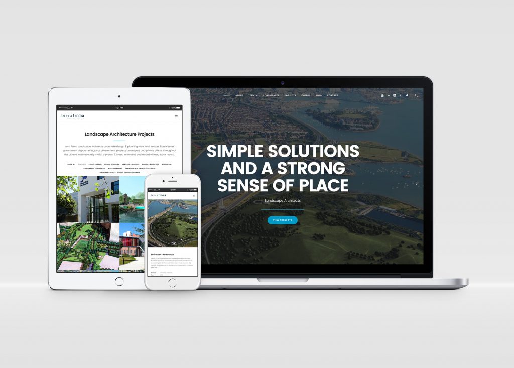
You can check out their new responsive site here:
http://www.terrafirmaconsultancy.com
Terra Firma website goes live,
9th March 2017
Automation vs human beings in design
Search for the term ‘automation’ on almost any design resource website and you’ll be met with a wealth of content and adverts all promising to make your life easier, streamline processes and make you a better designer.
But, in reality, what will the impact of automation be on the role of the designer in the future?
Automation – is it a dirty word?
Ever since the industrial revolution, machines have replaced human jobs. But with the rise of intelligent machines, the scale and nature of this process is escalating.
At a recent Ted X event the futurist Thomas Frey predicted that 2 billion jobs will disappear by 2030 – 50 per cent of all jobs. Driverless cars and delivery drones are just the beginning.
Companies within the creative and technology sectors constantly look to streamline their workforce by automating jobs. If a piece of software can replace you, it will.
In his Atlantic article, ‘A world without work’, Derek Thomson gives the example of AT&T and Google: “In 1964 America’s most valuable company, AT&T was worth $267 billion in today’s dollars and employed 758,611 people. Today Google is worth $370 billion but only has about 55,000 employees – less than a tenth the size of AT&T’s workforce in its heyday.” In short, better software and automation is helping Google and other companies make more profit with less people [Source: creativeblog.com].
Over the past 5 years there has been a significant shift amongst corporate clients to maximise efficiency by automating as much of their global marketing tools as possible. And why not? It makes sense financially, ensures brand integrity (to a certain degree) and keeps things simple. Right? Well, yes and no. Automation isn’t necessarily a dirty word, but it is a double-edged sword…
The impact of automation on design
Compared to a lot of other industries, design is one area where the substitution of human with machine seems unlikely. After all, designers deal with unstructured information, ideas and ‘blank sheets of paper’. But in reality, a modern designer will spend a lot of their time working with grids and using pre-set rules (such as Bootstrap) to ensure things work across multiple platforms and devices.
So, it makes sense for corporates to want to replace as much of the creative process as possible with automated templates and processes. But in reality, the initial savings can prove costly. Let me explain…
When a designer creates something, they consider much more than the mechanics and mathematics of the piece. Shape, size and function are considered alongside emotional response, humour, cultural reference – all things that cannot simply be replicated with an algorithm or template.
Consider this
You have a widget to sell.
Your creative agency creates a killer campaign for the UK. So successful in fact that you decide to go global.
To keep costs down, the campaign collateral gets converted into templates for use by local teams, but no consideration has been given for subtle variables and nuances such as the local market, cultural references, language differences (visual and verbal) and humour.
The result? A badly implemented interpretation of the original concept, put together by people with little or no design knowledge who are just trying to tick all the boxes. Something that resembles the original but just isn’t quite right. Because of the constraints of a template it’s poorly laid out, illegible in places, and in some cases, ugly.
In other words, FAIL.
So, what’s the answer?
Automation in design needn’t be a bad thing. If you can use it alongside cost-effective creative resources you can actually end up with a globlisation strategy that keeps the FD happy yet retains its creativity and effectiveness. You just need to remember to keep the human element. After all, people respond better to people than machines…
Automation vs human beings in design,
6th March 2017